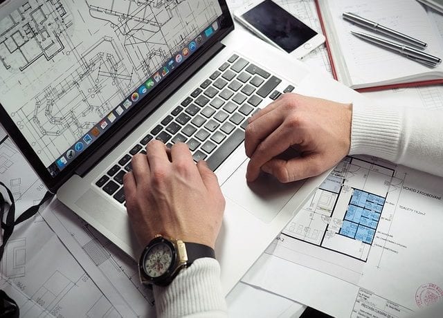
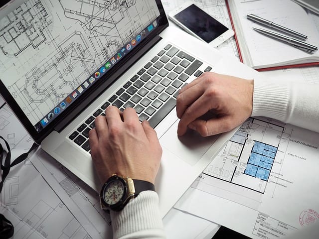
It is the time of year again where we’re working through an number of space designs for our clients with shows upcoming this spring. Through this exercise, I have been reminded that clients will first and foremost think of how their space looks, and trying to ensure proper traffic. Those are important, and require a great deal of mental bandwidth to work through. Ensuring the right products are displayed, the proper messaging is there, the space portrays the essence of the brand and some unique identifier to catch the eye of the attendees. Hopefully these are a success! But then what? What will the attendees’ in-booth experience be?
Avoid the trick or treat method
As an attendee I’ve seen far too many times, especially in the smaller booth spaces, people content with getting someone to their space, scanning their badge and sending them along with a giveaway. Yes, a lead was obtained, but it will remain ice cold since no rapport was built and nothing memorable happened for the attendee.
Create Strategic Flow
A reception counter is great to be an attendees starting point into a booth. From there though, many let the attendee free flow through the space. Ensure that the rest of the space needs to have a flow strategy:
- Reception takes information and engages attendee at the front of the space.
- Attendee moves to product demonstration one.
- Attendee moves to product demonstration two.
- Attendee moves to lounge area for refreshments and casual recap.
- Attendee exits rear of space.
Now the attendee has a controlled, consistent experience and is exposed specifically to what you would like before leaving.
At a consumer show I went through a space one time that methodically sent me through from one side to the other. After I had gone through the space I had been in a photo station, a smoothie bar, multiple meet and greats, watched several product videos and had received multiple t-shirts. People waited in line literally HOURS for this experience, and none of us will forget it. I can say that it did improve my opinion of the brand as well.
Simplicity
Yes, I realize that the paragraph I just wrote sounds like a space that is FAR from simple, but to be clear, that booth space was enormous! If that was a 20×20, it would have felt like a whirlwind, and extremely cluttered. It is important to balance simplicity in the design of the space with the active areas of engagement. Not to overwhelm, but to casually move the attendee through. This is part of the reason white walls and open floor plans are so prevalent; their simplicity keeps the attendee from feeling claustrophobic.
Train The Staff
All of this strategy can go up in smoke if those working the booth are not informed. Conduct pre-show meetings to detail the proper flow, the highlights of the space and even develop roles within the space (ie, Sarah engages people at the front of the space and takes them to Jennifer who will explain product A). Developing this plan ahead of time also lets you know ahead of time how many people need to work the booth and who to use to be most effective in each roll.
In the flurry of show prep and space design, I hope this can be a reminder to evoke the mind of the attendee in your design. To generate a booth space that pleases the marketing team and new prospects. The team at FrontLine is always happy to play the role of the attendee in your space! Let us help build the perfect experience!

