In all areas of our business, dealing with trade show booths, marketing events and all manor of branded environments, we are challenged with working within a particular space size. Fortunately, the technology we use to make scaled renderings and mock ups helps us avoid any major errors before production, but there’s still been many creative and well-intentioned ideas crushed because of the parameters of the space. I’ll lay out some of the points of emphasis that can help maximize the effectiveness and efficiency of the space.
Flow
Too often the focus is getting as much into a space as possible, and aside from a cluttered aesthetic, the physical pathway for the consumer can suffer. When considering the size of the space you may need, think about how much you’d need to hit all of the major branding and messaging elements while allowing for a natural, logical progression throughout. This might mean they start at a reception counter in the corner and work clockwise through a space, or maybe they start in the center for qualification and are directed to the left for product A or the right for product B. This applies to trade show spaces, retail, showrooms and even things like mobile marketing units.
If you have a set space already (purchased 20×20 trade show space, or leased retail space) work backwards and pair down all of the potential items until an organized flow develops.
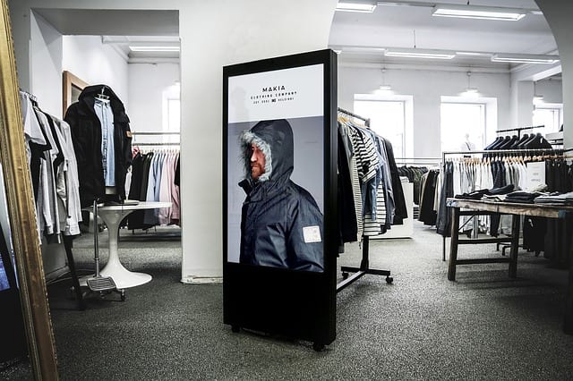
Utilize things like monitors and touchscreens to take the place of multiple displays and shelving for physical products. Also, take advantage of height where you’re able to, to decrease sprawl.
Regulations
Review regulations for the particular location, whether a showsite, retail space or any other venue there will be rules, codes and regs that can come into play. For instance, in the trade show world, the standard is using IAEE‘s guidelines. Some of these include a capped heights across backwalls, towers and freestanding displays to prevent obstructing neighboring booths.
Also consider ADA compliance. This comes into play a lot for creating those pathways for flow mentioned above, and requiring 36″ width for wheelchair accessibility. Which also allows a good minimum width for other consumers as well. ADA also has ramping requirements for raised flooring to consider.
Sight-lines
When creating a space, play director of the scene. What do you want your consumer to see, what should the focus be. Conversely, sometimes you need your staff to be the ones that see with a clear path when theft may be an issue or proprietary processes are being shown and they need to have photos/videos withheld. Remember that people will likely start looking top left and that below the knee is almost never seen. Balance barriers around the space so that they are directing traffic without walling off areas making them uninviting. Prominently place logos and messaging, and neatly merchandise product.
The purpose of all of these areas above is to drive the best possible consumer experience. Avoid clutter, create a natural flow and keep within the rules. Remember that the design of the space goes beyond the design of the displays within it. Utilize the aide of 3d rendering. It requires time and patience, but can illuminate pitfalls as well as new neat ideas. Take notice of the stores and booths that catch your eye and why that was, maybe there are takeaways for your design there as well.
It is important to remember that your space speaks to your clients about your firms capabilities, its image and may even influence their satisfaction with your organization. The space is also impacting your employees; their pride in the organization and attitude. Temporary or otherwise this is their work environment!