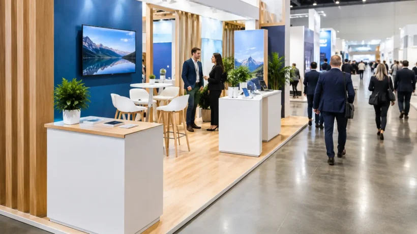
A 10-by-20 space can either feel like a focused brand environment or a costly storage closet with graphics. The difference is rarely the square footage alone. A thoughtful booth layout planning guide starts with what visitors must see, do, and remember, then gives your team the room and tools to make those moments happen.
For B2B exhibitors, layout is not an aesthetic decision made after the structure is selected. It determines whether prospects can enter comfortably, whether sales teams can start useful conversations, and whether operations can support the experience without visible friction. Strategically applied imagination works best when it is grounded in those practical realities.
Start With the Job Your Booth Must Do
Before considering towers, counters, monitors, or furniture, define the exhibit’s primary job. A product launch needs a different floor plan than a lead-generation campaign. A recruiting event may need relaxed one-on-one conversations, while a technical conference may require demonstrations that answer detailed questions.
Choose one primary objective and one supporting objective. For example, your primary objective might be to book qualified sales meetings, while the supporting objective is to increase awareness of a new service line. This hierarchy helps resolve layout decisions that otherwise become subjective. If meeting quality matters most, dedicated conversation areas deserve more space than a broad product wall. If awareness is the priority, sightlines and high-level messaging need to carry more of the load.
Also consider how you will measure success. Badge scans alone can be misleading if the layout encourages quick, low-value interactions. Meetings booked, demos completed, opportunities created, and follow-up engagement often reveal whether the environment supported the right behavior.
Read the Floor Plan Before Designing the Booth
Your booth does not exist in isolation. Its location, neighboring exhibitors, aisle exposure, venue rules, and show traffic patterns should influence the layout from the first sketch.
An island exhibit with access on four sides needs clear entry points and a visual center that works from multiple angles. A corner space benefits from two open faces but can become confusing if visitors cannot quickly tell where to begin. A linear booth has less room to recover from poor placement, so its message and engagement point must be especially clear from the aisle.
Study the show floor for likely traffic generators: registration, food service, keynote rooms, restrooms, education theaters, and major sponsors. A booth near a busy route may need a more open front edge to avoid creating a bottleneck. A quieter location may need bolder elevation, lighting, or a visible activity to earn attention from a distance.
Ceiling height, hanging-sign permissions, fire exits, columns, electrical access, and venue utility locations matter too. These details may seem operational, but they shape the visitor experience. A beautiful layout that places a key demo behind a utility run or leaves no practical route for installation is not a finished plan.
Map the Visitor Journey in Your Booth Layout Planning Guide
A strong layout gives visitors a natural progression rather than asking them to decode the space. Think of the experience in four stages: attract, orient, engage, and advance.
Attract happens at the aisle. Your highest-level brand message should be legible in seconds, not after someone has stepped inside. Avoid filling every visible surface with copy. One clear promise, a recognizable visual cue, and an obvious reason to approach are more effective than a wall of competing claims.
Orient happens at the threshold. Visitors should understand where to stand, where a demonstration begins, and who can help them. Open pathways, intentional flooring changes, overhead elements, and carefully placed counters can guide movement without turning the booth into a maze.
Engage is where the layout must support the actual conversation. A product demonstration area needs enough viewing depth for a small group. A hospitality counter needs a purpose beyond handing out giveaways. A meeting zone should feel sufficiently private for a business discussion without becoming hidden or uninviting.
Advance is the handoff to the next step: scheduling a meeting, capturing lead details, scanning a badge, receiving a sample, or connecting with the right specialist. Put this action near the point of engagement, not across the booth or behind a crowded reception counter. When the next step is inconvenient, interested visitors drift away.
Design for Flow, Not Just Footprint
The most common layout mistake is using every available inch. Full-looking booths can photograph well yet feel crowded during peak show hours. Leave room for people to pause, turn, watch, and speak without blocking the aisle or another visitor’s path.
As a practical rule, create a visible invitation from the aisle and protect a clear route through the space. Do not place a large counter directly at the entrance unless checking in visitors is central to the experience. Counters are useful anchors, but they can become physical and psychological barriers when they are the first thing attendees encounter.
Consider the difference between active and quiet zones. Product demos, interactive technology, and live presentations create energy and attract groups. Place them where they can be seen without forcing passersby into the middle of a crowd. More private discussions, lead qualification, and executive meetings generally belong deeper in the footprint or along a less exposed edge.
For smaller exhibits, flexibility often beats separation. A single well-designed engagement counter may serve as a demo station during busy hours and a conversation point during quieter periods. For larger footprints, distinct zones can improve clarity, provided they remain connected by a consistent visual story.
Give Sales Teams a Layout They Can Use
Your staff experience is part of your visitor experience. If team members have nowhere to set materials, charge a device, store personal items, or briefly reset between conversations, the booth will show the strain by midafternoon.
Build operational requirements into the layout early. Storage should be accessible but visually discreet. Power should reach demonstrations, monitors, and charging needs without creating trip hazards. Staff should be able to see approaching visitors and move between key areas without cutting through a client meeting.
Think about the staffing model as well. A booth designed for six active representatives will feel different from one staffed by two subject-matter experts. If the team needs to triage visitors, establish a welcoming front position and a natural path to deeper conversations. If experts are conducting scheduled demos, provide a waiting or observation area so late arrivals do not disrupt the presentation.
Training should reflect the layout. Every staff member should know the intended visitor path, the purpose of each zone, and how to redirect a conversation when the space is busy. The best exhibit design cannot compensate for a team working against its logic.
Use Graphics and Technology With Restraint
Large-format graphics establish presence, but their job is not to explain your entire company. Use them to communicate the most valuable ideas at a distance. Supporting content can live closer to the visitor, where it helps sales conversations and demonstrations.
Technology should earn its footprint. A screen can clarify a complex process, showcase work that cannot travel, or give prospects a hands-on way to explore. It can also become a passive distraction if it is not connected to a staff-led interaction. Ask what the visitor gains from using it and what your team learns in return.
Lighting is another layout tool, not merely a finishing touch. It can pull attention toward a demonstration, create a comfortable meeting zone, and make brand colors read accurately. Balance impact with the practical needs of cameras, screens, product displays, and long event days.
Plan for Logistics Before the Show Opens
A layout is only successful if it can be installed, operated, and packed efficiently. Confirm where crates, literature, giveaways, cleaning supplies, and personal belongings will live. Review freight timing, labor requirements, electrical orders, internet needs, and any venue restrictions before design decisions become expensive to change.
This is especially valuable for organizations exhibiting in multiple cities or managing a mix of custom and rental properties. Modular components, reusable graphics, and documented packing plans can protect brand consistency while reducing the burden on internal teams. The right choice depends on event frequency, storage capacity, budget, and how often your message or footprint changes.
A turnkey exhibit partner can bring design, production, logistics, and on-site requirements into one coordinated plan. That coordination is not just administrative support. It protects the creative concept from being diluted by last-minute workarounds.
Test the Plan Like an Attendee
Before approving the final layout, walk it as if you have never seen the brand. From the aisle, can you identify what the company offers? Can you tell where to enter? Once inside, can you watch a demo without standing in a traffic lane? Can a sales conversation happen without being overheard by everyone nearby?
Then test it from the team’s perspective. Can staff replenish materials, access storage, handle a rush, and reset the space at the end of the day? A layout that answers both sets of questions creates a more confident presence than one built around a rendering alone.
The strongest booth layouts make the right next step feel obvious. When brand story, visitor flow, staff needs, and event operations work together, the physical space stops being a backdrop and becomes an active part of the conversation.