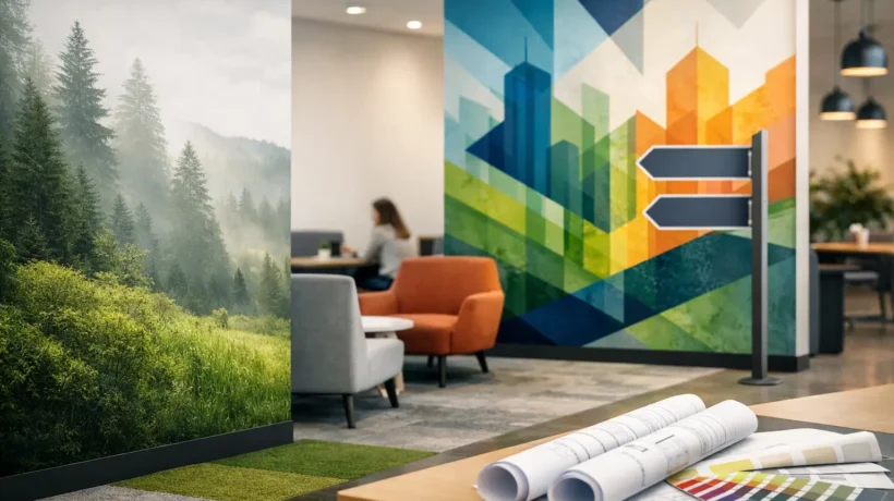
A lobby wall can introduce a company before a receptionist says hello. A directional sign can prevent a visitor from missing a meeting. A trade show graphic can give a sales team a credible opening line from across the aisle. This environmental graphics guide is built around that reality: graphics in physical spaces are not decoration alone. They are working brand assets that shape attention, movement, understanding, and confidence.
For marketing leaders, event teams, and operations managers, the opportunity is substantial. Environmental graphics can turn a temporary exhibit, corporate office, retail setting, or customer activation into a more recognizable and useful brand experience. But visual impact only holds its value when it is connected to the goals of the space, the behavior of the audience, and the practical demands of production and installation.
What Environmental Graphics Are Designed to Do
Environmental graphics are visual elements created for a physical environment. They can include large-format murals, dimensional logos, window graphics, wayfinding, floor graphics, product storytelling, branded architectural panels, privacy films, and campaign messaging. In an exhibit, they may frame a product demonstration or make a compact footprint appear more open. In an office, they can reinforce culture while helping visitors navigate the space. In retail, they can guide shoppers from first impression to purchase decision.
The strongest programs do more than place a logo on a wall. They establish a hierarchy of information. A person approaching the environment should quickly understand who the brand is, what it offers, and where to go next. The details can then reward a closer look: a product benefit, a customer proof point, a meaningful statistic, or a clear invitation to speak with the team.
That hierarchy matters because physical environments compete for attention differently than websites or presentations. People are walking, talking, carrying materials, checking schedules, and making quick judgments. A graphic with too much copy may be technically accurate but functionally invisible. A beautiful feature wall without a purpose may photograph well but do little to support a business conversation.
Environmental Graphics Guide: Start With a Business Brief
Before selecting finishes, colors, or imagery, define what the environment needs to accomplish. The answer will change the design direction.
A trade show exhibit may need to stop traffic, qualify visitors, and give sales representatives a clear story to lead with. A corporate interior may need to make a new office feel connected to the company’s values while creating a polished experience for candidates and clients. A retail installation may need to support a seasonal campaign, clarify product categories, or make a limited-time promotion hard to miss.
A productive brief connects the graphics to a specific audience, action, and setting. Consider who will encounter the space, how long they will have to absorb it, what they should understand immediately, and what action should follow. For an event, the desired action may be a demonstration, meeting, or lead capture. For an office, it may be finding the right room or leaving with a stronger impression of the organization.
It also helps to identify operational constraints early. Ceiling height, wall condition, venue rules, power access, installation windows, fire codes, and shipping requirements can affect both the concept and the budget. Bringing these realities into the conversation at the start protects the creative idea rather than limiting it later.
Design for Distance, Movement, and Moments
Environmental graphics should be planned from the outside in. Start with what someone sees from a distance, then what becomes clear at approach range, then what they discover once they are in the space.
At a trade show, a large brand statement or distinctive visual can create the first read from the aisle. At a closer distance, product categories, key benefits, and demonstration cues should become visible. Inside the exhibit, conversation graphics, feature panels, and digital content can support the deeper sales story. Trying to present all three levels at once often produces clutter.
The same principle applies to corporate and retail environments. A lobby may need a confident brand marker visible at entry, while a hallway needs directional clarity and a meeting room needs a more intimate expression of company culture. Each zone has a different job. Repeating the same message everywhere can weaken the experience instead of strengthening it.
Movement is equally central. Look at arrival points, sightlines, doorways, bottlenecks, and natural stopping places. A directional sign positioned after a confusing turn is too late. A product message hidden behind a reception queue will not perform as intended. Floor graphics can guide visitors effectively, but only when they support the path people already want to take rather than asking them to behave unnaturally.
Build a System, Not a Collection of Surfaces
A branded environment feels deliberate when graphics share a visual language across materials and locations. That does not mean every wall needs the same treatment. It means typography, image style, color use, messaging tone, and graphic scale work together.
Start with the brand standards, then adapt them for the physical setting. A color palette that works beautifully in a digital brand guide may need adjustment under exhibit hall lighting or against an existing interior finish. Fine type and subtle tonal shifts can disappear when viewed from ten feet away. High-contrast graphics can improve legibility, but too much contrast can make an environment feel loud or fragmented.
Photography, illustration, texture, and dimensional elements should also have clear roles. Large lifestyle imagery can create emotional context. Product visuals can make a technical offering more concrete. Dimensional logos and layered panels can add depth where a flat print would feel temporary. The right mix depends on the audience and the life of the installation.
For a three-day event, speed, portability, and reusability may deserve more weight than permanent architectural detail. For a client-facing headquarters, durability and integration with the space may justify a more customized solution. Neither approach is inherently better. The best choice is the one that supports the intended experience without creating avoidable cost or complexity.
Select Materials Around Performance
Material selection is where imagination meets execution. Fabric graphics can create a refined, low-glare appearance and are often well suited to portable exhibit structures. Rigid panels can deliver crisp edges and support dimensional applications. Vinyl may be a practical choice for windows, walls, floors, and short-term campaign installations. Specialty films, backlit graphics, and tactile finishes can create memorable moments when used with purpose.
The decision should account for viewing conditions, durability, transportation, install surface, removal requirements, and sustainability goals. A wall graphic that looks excellent in a rendering may fail if the wall has significant texture or if the adhesive is not appropriate for the paint finish. A floor graphic needs to meet safety requirements and withstand the expected traffic. A graphic intended for repeated events needs packing, labeling, and replacement planning from the beginning.
Color management deserves close attention as well. Brand colors can shift across fabric, vinyl, rigid substrates, and illuminated surfaces. Proofing critical graphics before full production helps prevent surprises, particularly when multiple components must appear as one coordinated environment.
Plan Installation as Part of the Creative Process
Installation is not the final administrative step. It is part of the design solution. The most polished graphics can lose their impact through poor alignment, rushed surface preparation, difficult access, or a missed venue deadline.
A clear installation plan should account for site measurement, surface inspection, staging areas, lift access when needed, union labor requirements, security procedures, and the sequence in which the environment will be built. In an exhibit program, graphics also need to align with freight schedules, booth construction, electrical work, and product delivery. In a corporate setting, installation may need to happen after hours to avoid disrupting employees and visitors.
This is where experienced project management creates real value. Designers, fabricators, installers, and client stakeholders need a shared view of the details that affect the final result. FrontLine Exhibits approaches these moving parts as one connected program, helping teams protect both the concept and the timeline.
Keep the Program Useful After Opening Day
Once the environment is installed, evaluate it in use. Watch where people pause, where they ask for directions, which messages prompt questions, and what gets photographed or shared. Sales teams and front-desk staff often have the clearest view of what visitors actually notice.
For recurring events, retain artwork files, production specifications, installation notes, and photographs of the final setup. This makes future updates faster and reduces the cost of recreating work that already exists. Asset management is especially valuable when graphics travel between shows, regions, or campaign formats.
A well-planned environment should make the next conversation easier, not simply make the space look better. When every graphic has a role, the brand becomes more visible, the visitor journey becomes more intuitive, and the team behind the space gains room to focus on the business opportunity in front of them.