A prospective buyer should be able to understand your value from the aisle, before a salesperson says hello. That is the real standard for how to choose exhibit graphics. Your graphics are not decoration applied at the end of an exhibit project. They are the visual system that helps the right audience recognize your brand, understand why they should stop, and know what to do next.
For event teams working against tight timelines and significant show costs, the goal is not simply to make a booth look polished. It is to create a physical environment that communicates clearly under real trade show conditions: crowded aisles, competing visual noise, inconsistent lighting, and limited visitor attention. The best exhibit graphics balance strategic intent with practical production decisions.
Start With the Job Your Graphics Need to Do
Before discussing colors, imagery, or substrates, define the business outcome the exhibit must support. A booth built to introduce an unfamiliar technology needs different graphics than one designed to deepen relationships with existing customers. A recruiting event may call for an employer-brand story, while a product launch may require a highly focused proof point and demonstration path.
Ask what a visitor should understand at three distances. From across the aisle, they should recognize your brand category or a compelling high-level promise. At the edge of the booth, they should see the specific reason to engage. Once inside, they can absorb product details, credentials, use cases, and calls to action.
This distance-based approach prevents a common problem: trying to place every sales message on the back wall. When every panel competes for attention, nothing leads. Prioritize one primary message, then give supporting messages a clear place in the visitor journey.
How to Choose Exhibit Graphics for Fast Recognition
Trade show attendees scan before they read. Your most prominent graphics should therefore communicate in seconds, not paragraphs. A strong brand mark, a concise headline, and a distinctive visual idea will typically work harder than a dense list of capabilities.
That does not mean reducing a complex business to a vague slogan. It means choosing language with a clear audience benefit. “Advanced Solutions for Modern Business” could describe almost anyone. A statement that identifies a specific challenge, outcome, or audience creates a more meaningful opening for conversation.
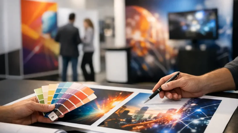
Use your brand standards as a foundation, but account for the physical environment. Colors that look balanced on a laptop may become subdued beneath convention-center lighting. Fine type that is elegant in a brochure may disappear from ten feet away. A capable exhibit partner will review artwork at intended scale and consider the sightlines created by the structure, neighboring booths, and overhead signs.
Photography, illustration, and texture should also earn their space. A single original image with a clear connection to your offer can create more presence than several generic stock photos. If product imagery is essential, make sure it is large enough to read quickly and surrounded by enough visual breathing room to remain useful.
Match Content to the Exhibit Architecture
Exhibit graphics work with the structure, not independently of it. The same design may need to serve a fabric backwall, a rental island exhibit, a modular frame system, a retail display, or a permanent corporate installation. Each environment introduces different dimensions, viewing angles, panel breaks, and production requirements.
Map the graphics to the architecture early. Identify the hero wall, entry points, meeting areas, product demonstration zones, counters, towers, and any surfaces visible from the aisle. This is especially important for island exhibits, where visitors approach from multiple directions and no single backwall can carry the entire story.
Consider where the eye naturally travels. Overhead elements and tall structures are useful for brand recognition from a distance, but they are not the place for detailed information. Low graphics can be effective for product displays or seated conversations, yet they may be obscured by people on a busy show floor. Place essential messaging where it will remain visible when the booth is active.
If the exhibit will travel to several events, build a graphic system rather than a one-show design. Core brand graphics can remain consistent while targeted messaging, event promotions, regional imagery, or product panels change by campaign. This approach protects brand continuity and can reduce the cost and complexity of future updates.
Select Materials Based on Use, Not Just Appearance
Material selection affects color, durability, setup time, shipping, storage, and replacement cost. There is no universally best exhibit graphic material. The right choice depends on how often the asset will be used, the display system, the installation environment, and the level of flexibility required.
Fabric graphics are often a strong choice for portable and rental exhibit systems because they are lightweight, can create a smooth, premium look, and may pack efficiently. However, they require thoughtful handling and accurate tensioning. Rigid panels can support crisp imagery and create a more architectural presentation, but they may increase shipping volume and need additional protection between events.
Vinyl graphics can be effective for counters, walls, windows, and custom surfaces, particularly when a temporary application is needed. Their success depends on proper surface preparation, installation conditions, and removal planning. For a long-term corporate or retail environment, resistance to wear, cleaning needs, and exposure to sunlight may matter as much as the initial visual effect.
Discuss lifecycle expectations before production begins. A graphic intended for one product launch can be produced differently from an asset expected to support a multi-year event program. Choosing the lowest upfront cost without considering replacement frequency, storage requirements, and labor can create higher costs later.
Design for Real Lighting and Real People
Lighting can elevate a graphic concept or quietly undermine it. Dark areas may absorb key messaging. Highly reflective surfaces can produce glare. Backlit graphics can create exceptional presence, but their artwork must be designed for illumination rather than simply reused from a standard wall panel.
Plan for the lighting conditions you can control, while recognizing that venue lighting will vary. If a product demonstration, private meeting area, or branded focal point needs attention, integrate lighting into the overall exhibit concept. Do not treat it as an afterthought once graphics are already approved.
People change the visual landscape as well. A graphic that looks effective in a clean rendering may be blocked by a demonstration crowd, a reception counter, or a staff member standing in front of it. Review the booth from the visitor’s perspective and think through how traffic will move. The strongest layouts make the message visible even when the space is doing its job and drawing people in.
Build the Approval Process Around Accuracy
Graphic errors are expensive because they often appear late, when production schedules and freight deadlines leave little room for correction. Establish a review process that covers more than spelling and logo placement. Confirm dimensions, panel assignments, image resolution, bleed, color expectations, product claims, legal language, and call-to-action details.
Assign one internal decision-maker or a small approval group with defined responsibilities. Too many disconnected reviewers can create conflicting edits and slow production. At the same time, marketing should not carry the process alone if sales, product, legal, or operations teams own information that appears in the booth.
Proofs and production samples are valuable checkpoints, particularly when color fidelity is central to the brand or when a graphic uses a new material or print method. A digital proof can confirm layout, but it cannot always predict how a large-format print will appear under event lighting.
Think Beyond the Booth Walls
A coordinated graphic program extends the exhibit experience across the elements visitors actually touch: reception counters, kiosks, hanging signs, demo stations, literature displays, floor graphics, and meeting spaces. Consistency matters, but repetition is not the goal. Each surface should contribute to the same story while serving its own function.
For example, an overhead sign may establish brand recognition, a backwall may communicate the central promise, and a demo station may show the proof. The visitor should feel a coherent progression rather than encounter the same headline repeated on every surface.
This is where strategically applied imagination has commercial value. Thoughtful exhibit graphics create a memorable visual presence, but they also direct attention, support conversations, and make a complex offering easier to understand. FrontLine Exhibits approaches those decisions as part of the full environment, connecting concept, production, logistics, and on-site execution.
The best graphic choice is rarely the loudest option or the one with the most information. It is the one that gives your audience a clear reason to notice, enter, and continue the conversation – while giving your team an exhibit program they can execute with confidence.